
わたくしども銀座HIKO
ではステファノリッチや
シルヴィオ フィオレッロ
などの高級ネクタイを
取り扱っています。
中には店頭でそれらを
御覧になって
「なぜこんなに高価なの?」
とお言葉を頂くことも
珍しいことではありません。
「たかがネクタイでしょう」
そう思われる方も
いらっしゃるかも、と
思います。
At Ginza HIKO, we carry fine ties from brands such as Stefano Ricci and Silvio Fiorello.
Some customers, upon seeing them in our boutique, ask us, “Why are they so expensive?”
After all, some may think, “It’s just a tie.”
けれど、その一本の中に
どれほど多くの人々の
手仕事と、気が遠くなる
ような工程が込められて
いるかを知れば
ネクタイを見る目は
少し変わるのでは
ないでしょうか。
今回は、スタッフ佐藤が
イタリア出張中に訪ねた、
コモ湖近郊のシルク
プリント工房での現地
レポートをお届けします。
Knowing how much handwork and how many painstaking steps go into a single tie may change the way we see it.
In this article, we share a report from our staff member Sato, who visited a silk printing workshop near Lake Como during his trip to Italy.
※本ブログの動画は、音声が
ついています。再生時の
音量にお気をつけ下さいませ。
まずは本日の記事の
ダイジェスト動画を。
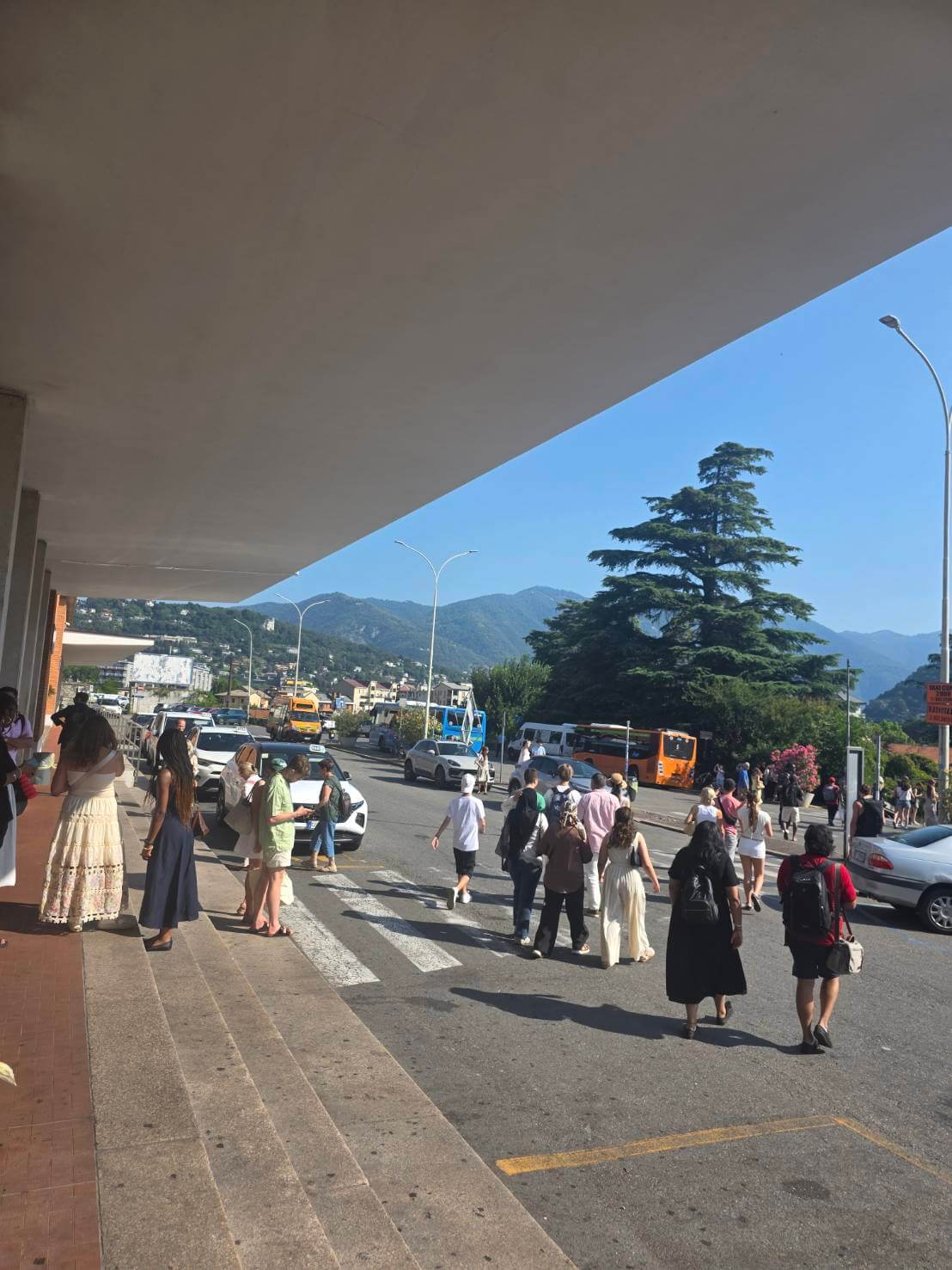
コモ湖はミラノから電車で
1時間ほどの距離、
イタリア北部のアルプス
山脈のふもとにあります。
Lake Como is located about an hour by train from Milan, at the foot of the Alps in northern Italy.

スイスとの国境が近く
山に囲まれたリゾート地
としても知られるエリア
です。
そして何より、上質な
シルクの産地としても
名高い地なのです。
It is known as a resort area near the Swiss border, surrounded by mountains.
Above all, it is also renowned for its fine silk.
なぜコモ湖のシルクは
欧州ブランドにおいて
大きなシェアを誇るのか
穏やかな気候が養蚕
(カイコを育てること)に
適しており、15世紀末に
ミラノ公が地域振興のため
蚕の餌となる桑の木をコモ
周辺に大量に植えさせた
ことが始まりという説が
あります。
Its mild climate was well suited to sericulture, or silkworm farming.
It is said that the origins of Como’s silk industry date back to the late 15th century, when the Duke of Milan had large numbers of mulberry trees planted around Como to promote the region.
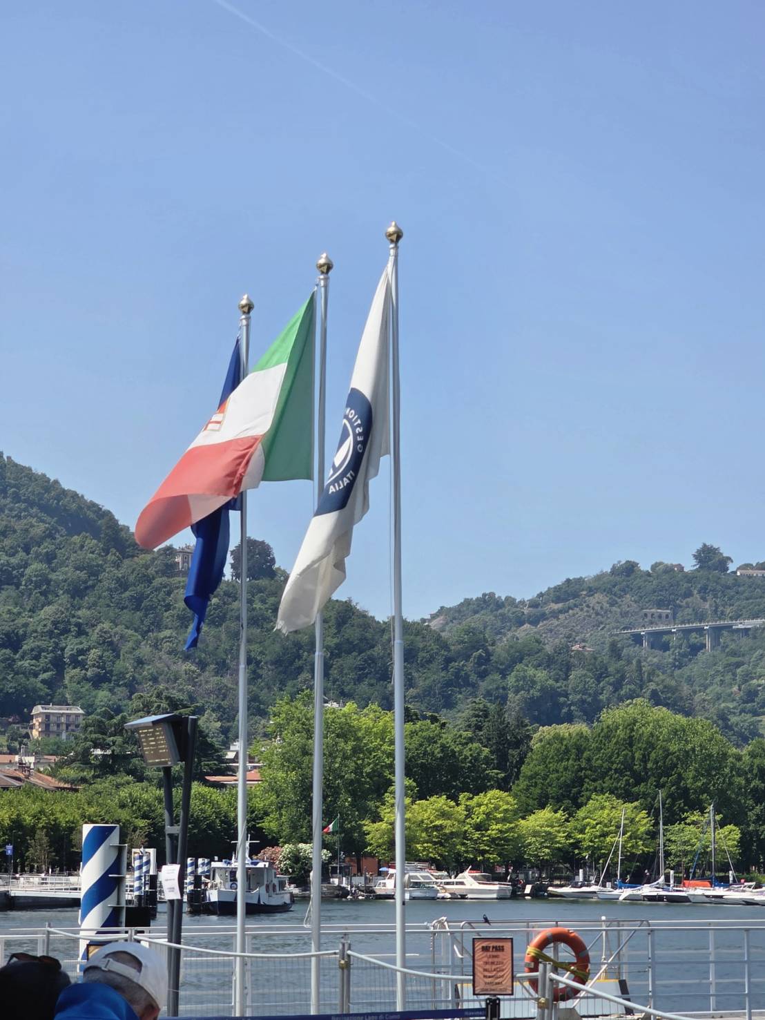
純度が高く豊富な水が
コモ湖のアルプスから
湧き出るこの一帯は、
シルク生産における
生地の洗浄や染色の
プロセスにおいても
非常に適していました。
職人を育成する学校
なども作られ、これらの
要素が重なることで
この地域一帯には
シルク産業が深く
根付いたのです。
現在はシルクそのものは
他の地域から輸入して
いますが、長年培われた
染色の技術力の高さに
より今もヨーロッパの
高級ブランドが使う
シルクのシェアの多くを
コモ湖で染めた品が
占めています。
The pure Alpine water flowing into Lake Como was ideal for washing and dyeing silk.
With schools established to train artisans, silk craftsmanship became deeply rooted in the region.
Today, while raw silk is often imported, Como remains renowned for its dyeing expertise and continues to support Europe’s luxury brands.
ステファノリッチや
シルヴィオフィオレッロ
の生地も手掛ける
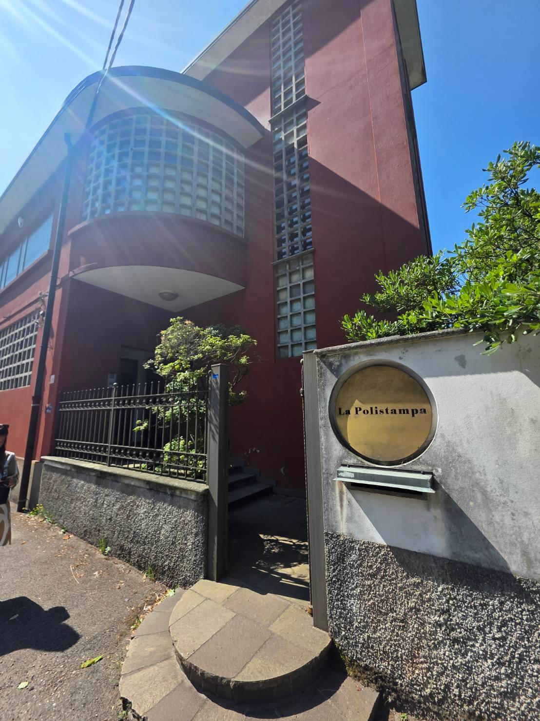
佐藤が訪れたのは
ステファノリッチや
シルヴィオフィオレッロ
といった一流ブランドの
シルク生地を手がける、
高い技術を持つ工房です。
こちらでは、現代的な
デジタルプリントと、
昔ながらのシルク
スクリーンによる
ハンドプリントの
両方が行われています。
Sato visited a highly skilled workshop that produces silk fabrics for leading brands such as Stefano Ricci and Silvio Fiorello.
The workshop uses both modern digital printing and traditional hand screen printing.

上記はデジタルプリントの機械で実際に印刷している様子の動画です。
デジタルプリントは
多色表現、写真のような
グラデーションを得意
とする優れた技術です。
インクジェットのプリンターを
イメージしていただくと
分かりやすいかもしれません。
一方、
シルクスクリーンによる
ハンドプリントは、
完成した柄を色ごとに
分解し、それぞれの色に
対応した版を使って
一色ずつシルクの上に
染料を重ねていく技法です。
Digital printing excels at rich color expression and photo-like gradations.
Hand screen printing, on the other hand, separates a design by color and uses a different screen for each one, layering the dyes onto silk by hand, one color at a time.
シルクスクリーンとは
シルクスクリーンの
スクリーンとは細かな
網目状の布を枠に
張った版のことです。
A screen in silk screen printing is a fine mesh fabric stretched over a frame, used as a printing stencil.

かつては絹の布が使われて
いたためこの名がありますが、
現在では主にポリエステル
などの丈夫なメッシュが
用いられています。
It takes its name from the silk mesh once used for this process.
Today, however, durable meshes such as polyester are mainly used.

柄の部分だけ染料が
通るように加工した
スクリーンを使って、
一色ずつシルクの上に
色を重ねていきます。
4色の柄であれば
少なくとも4枚。
色数や濃淡が増えれば、
5枚、6枚と必要な
版(スクリーン)の数も
増えていきます。
Using screens prepared so that dye passes only through the patterned areas, each color is layered onto the silk one by one.
A four-color design requires at least four screens.
As the number of colors and shades increases, five or six screens may be needed.

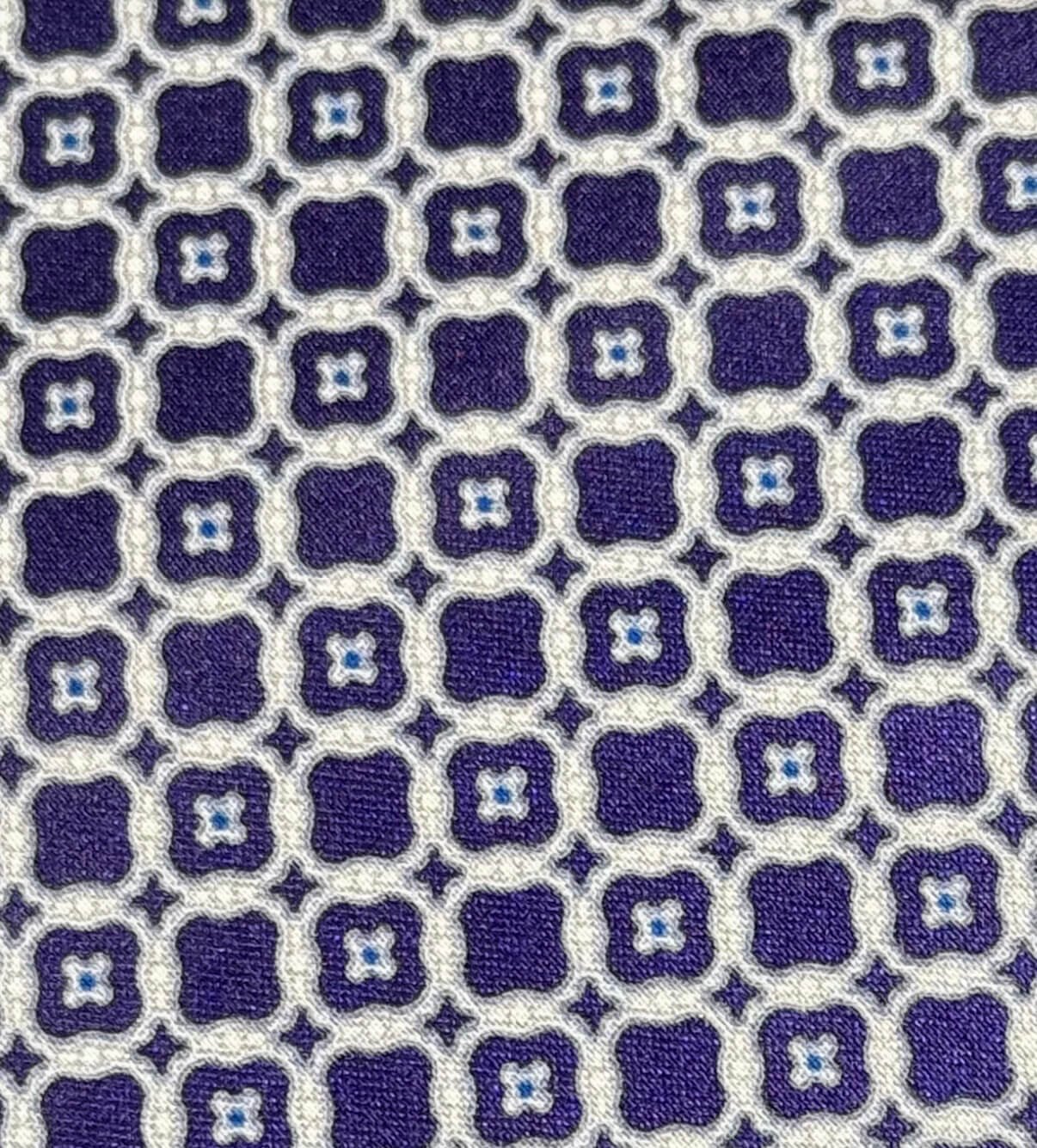
たとえばこちらの
ステファノリッチのタイ、
一見シンプルな
柄であっても
大きく拡大すると
濃紺、グレー、淡いグレー、
ブルーなど、複数の色で
構成されています。
Take this Stefano Ricci tie, for example.
At first glance, the pattern may look simple.
But when enlarged, you can see that it is made up of several colors, including dark navy, gray, light gray, and blue.
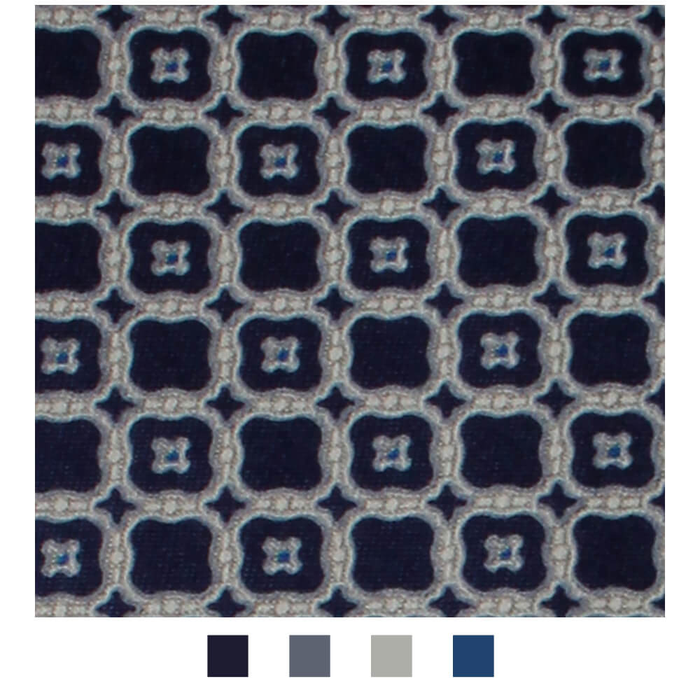
これらの柄を一度に
プリントするのが
デジタル、色別に版を
作って染めていくのが
シルクスクリーンです。
Digital printing prints the full design at once.
Silk screen printing, on the other hand, uses separate screens for each color, dyeing the silk one color at a time.
例えば先程のネクタイの
柄も下記の4つに
分けられます。
For example, the pattern of the tie shown above can be separated into the following four layers.

ダークネイビーの柄
Dark navy layer.

グレーの柄
Grey layer.
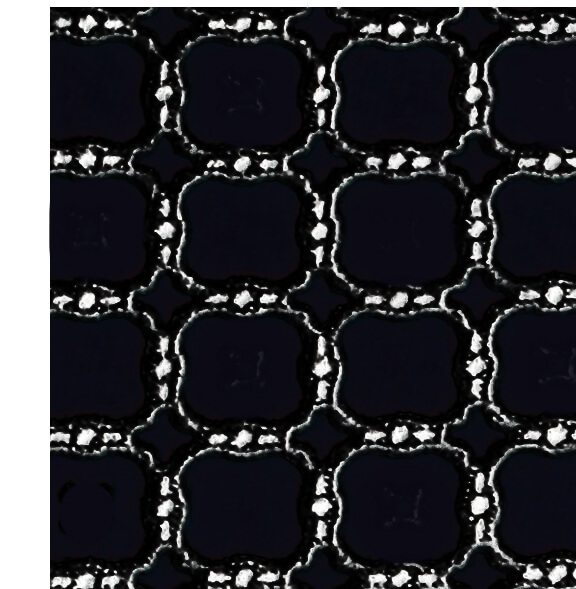
グレーの上に乗せる
白の柄
(柄をわかりやすく
するため、上記画像は
柄以外の部分は黒塗り
しています)
White layer placed over the gray.
For clarity, the areas outside the pattern are shown in black in the image above.
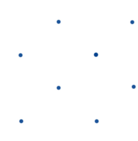
そして、青のドットの柄。
And the blue dot layer.
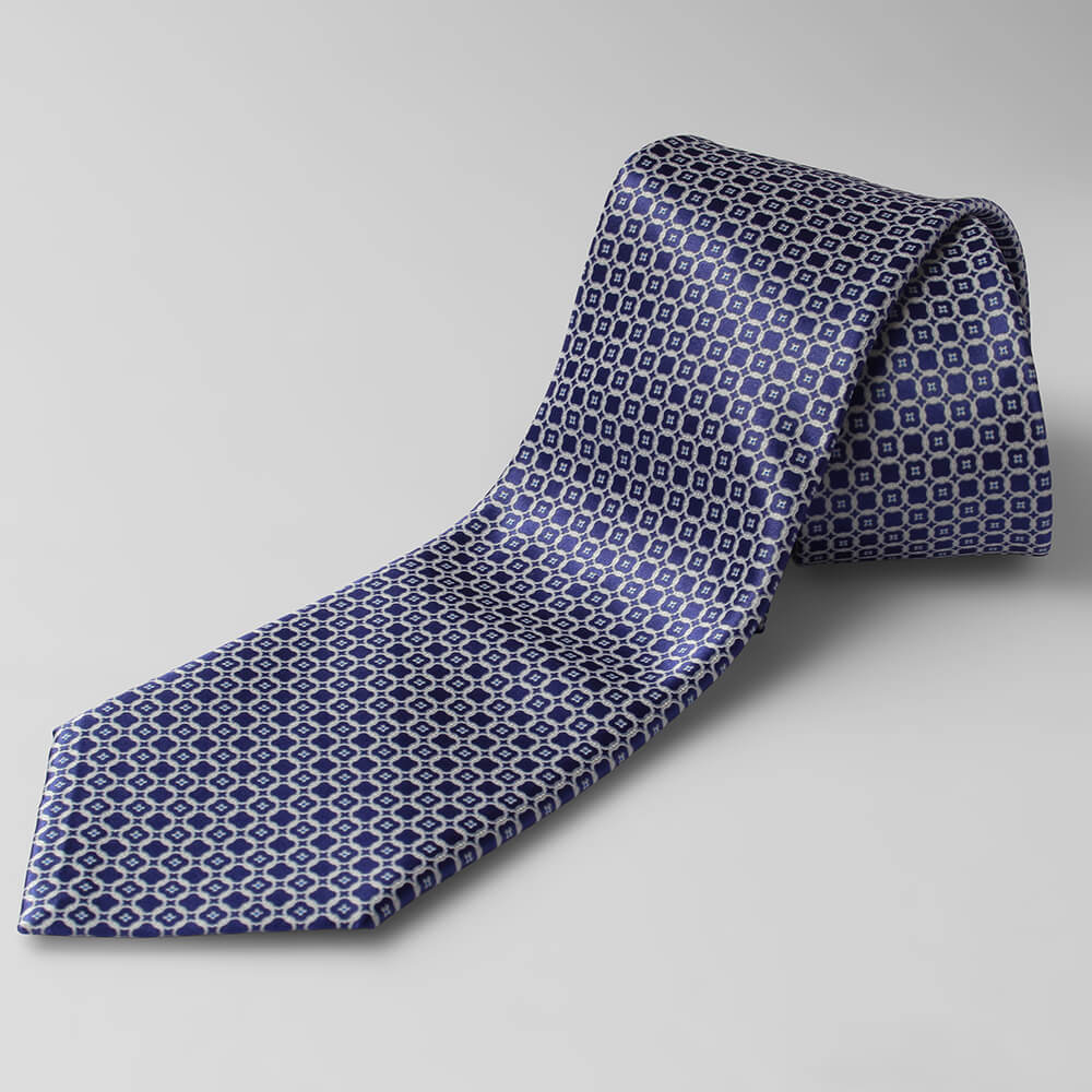
これら4つの版を
重ねることでこの柄が
出来上がるのです。
By layering these four screens, the complete pattern is created.
実際の作業工程を視察
実際に工場に足を
踏み入れると、まず
気温の高さに怯んだと
佐藤は言いました。
スクリーンそのものや
布地を熱で早く乾かす
ため、工房の中は大変な
暑さだったそうです。
働く人たちの体調や
作業効率を保つため
朝の5時半から仕事が
始まるのだとか。
When Sato entered the workshop, the first thing that struck him was the heat.
The screens and fabrics are dried with heat, making the workshop extremely hot.
To protect the artisans’ health and efficiency, work begins as early as 5:30 in the morning.
さてその工程において
次に佐藤が驚いたのは、
色を作る「調色」の難しさ
でした。
In this process, what first surprised Sato was the difficulty of color mixing.
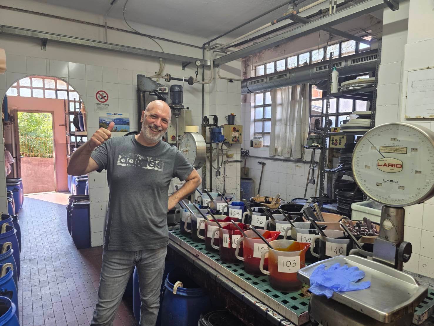
調色のスペシャリスト
ステファノさん。
日本のアーティスト
Adoさんの大ファン
だそうで
「ミラノのライブにも
行ったよ!」とのこと。
Stefano, the color-mixing specialist, is apparently a big fan of the Japanese artist Ado.
He told us, “I even went to her concert in Milan!”
この一角では、
様々なブランドから
指定された複雑な色を
正確に再現するために、
熟練した職人がその日の
天気まで考慮しながら
染料を調合していきます。
In this area, skilled artisans mix dyes to precisely recreate colors specified by various brands, taking into account even the temperature and humidity of the day.
試しに、HIKOのテーマ
カラーのオレンジを
調色して頂きました。
下記はその動画です。
一言でオレンジと
いっても、赤みが強い
オレンジもあれば
黄みが強い色もあり、
また鮮やかさや明るさで
印象は大きく変わります。

ブランド側がイメージ、
指定する色を正確に
シルク生地の上で
再現するのは、我々が
思うほど簡単なものでは
ありませんでした。
Even within the word “orange,” there are reddish oranges and yellowish oranges.
Brightness and vividness can also change the impression greatly.
Recreating the exact color envisioned by a brand on silk fabric was far more difficult than we had imagined.
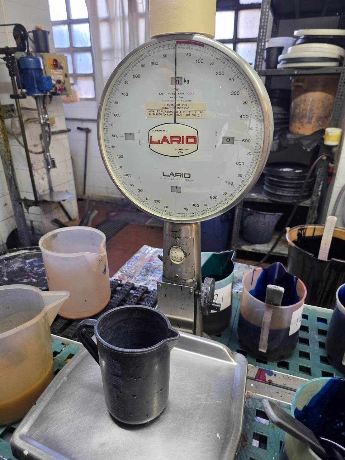
寸分違わぬ同じ配合
であっても、気温や湿度
など工房内の環境によって
染料の状態や乾き方、
シルクへの入り方は
微妙に変わるそうです。
求められるのは、計りの
目盛り通りの分量を
混ぜる作業ではなく、
長年の経験によって
培われた目と感覚。
色が決まると、
いよいよプリントの
工程に入ります。
Even with the exact same formula, the condition of the dye, how it dries, and how it enters the silk can change subtly depending on the temperature and humidity in the workshop.
What is required is not simply measuring and mixing, but the eye and intuition gained through years of experience.
Once the color is ready, the printing process finally begins.

工房には、
およそ40メートルもの
長い作業台があります。
その上にシルクを
まっすぐに張り、職人たちは
スクリーンの枠を手で
抱えて移動。
決められた位置に丁寧に
一か所ずつ置いて、
染料をのせていきます。
Inside the workshop is a long printing table, about 40 meters in length.
Silk is stretched straight across it, and the artisans carry the screen frames by hand.
They carefully place each screen in its exact position, one section at a time, and apply the dye.
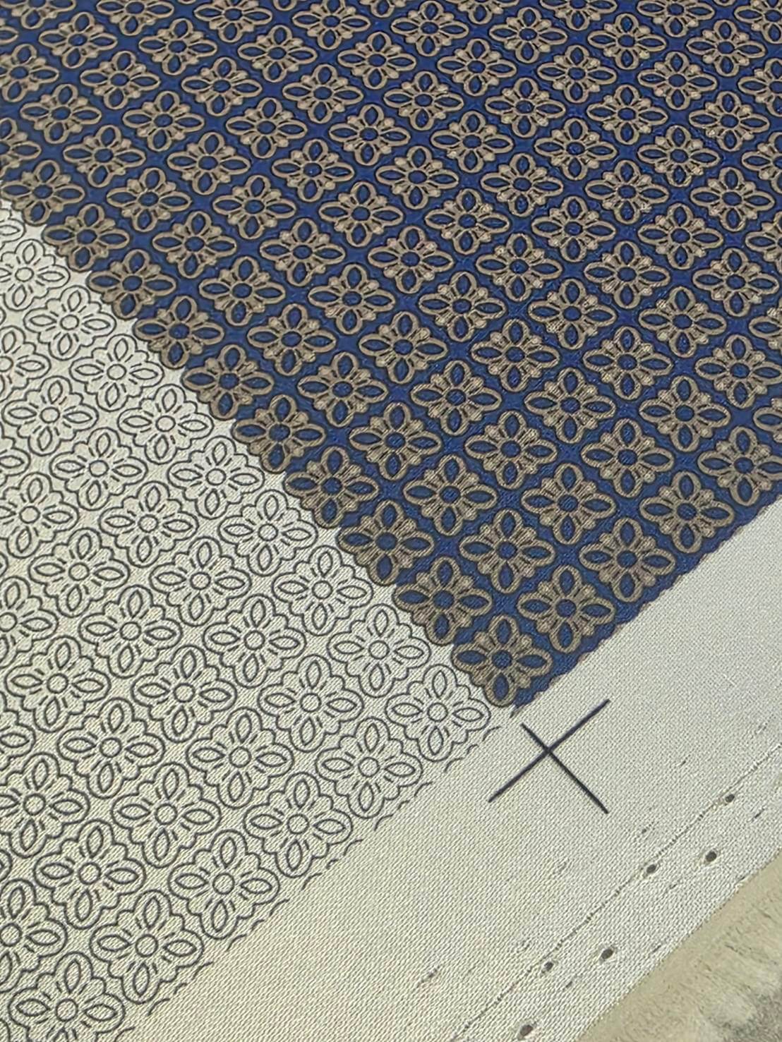
上記写真は、実際に線画が
刷られた部分と、その他の
色が全て刷られた部分です。
The photo above shows one section where the line drawing has been printed, and another where all the other colors have already been applied.
もし版を置く際にわずか
1ミリでもずれてしまったら、
柄が成り立たなくなります。
染め直しは一切できません。
大きなスクリーンを
正確な位置に合わせ、
ずれないように固定し
息を合わせて染料を
引く作業は見ている側も
緊張感が。
If the screen is even one millimeter out of place, the pattern will no longer align.
There is no room for re-dyeing.
Watching the artisans position the large screen with precision, hold it firmly in place, and pull the dye in perfect rhythm was tense even for us.
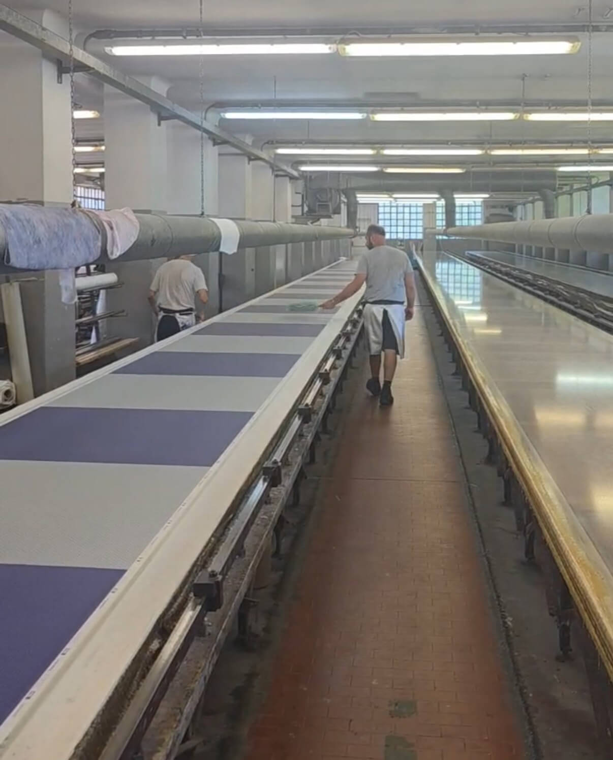
一か所刷るたびに
一版分のすき間を空けて
(その方が全体が乾きやすく
作業がしやすいようです)
スクリーンを移動させ、
また位置を合わせて
同じ作業を繰り返します。
そして一色目が
終われば、
次の色の版へ。
また位置を合わせ、
また染料を重ねる。
これを40メートル分
繰り返すのです。
Each section is printed, then the screen is moved, aligned again, and the same work is repeated.
Once one color is finished, they move on to the next screen.
This continues across the full 40-meter table.

ステファノリッチでも
シルヴィオフィオレッロ
でも言えることですが、
同じ図柄であっても
色違いが数多く
作られます。
For both Stefano Ricci and Silvio Fiorello, the same design is often produced in many different colorways.
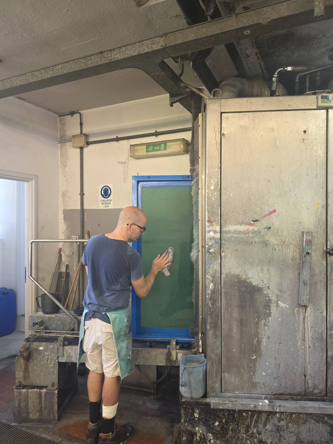
そのため、使い終えた
スクリーンはその都度
きれいに洗い、乾かし、
また次の配色のために
使われます。
染料が少しでも残れば、
次の色に影響します。
乾きが不十分であれば、
作業の精度にも関わります。
暑さの中で集中力を保ち
続け、わずかな妥協も
許さない。
まさに一流の職人たちの
世界がそこにありました。
Used screens are washed, dried, and used again for the next colorway.
Even the slightest remaining dye could affect the next color, and insufficient drying could compromise precision.
Behind each beautiful pattern is the humble repetition of printing, washing, drying, and printing again.

特色ならではの澄んだ発色。
色面の奥行き。
生地の裏側まで色が通る、
いわゆる「裏抜け」の美しさ。
そして、シルク本来の
しなやかな風合い。
それらは、単に
「柄を印刷する」という
言葉では言い尽くせない
ものです。
The clear brilliance of custom colors.
The depth of each color field.
The beauty of the dye passing through to the reverse side.
And the supple feel that only fine silk can offer.
These qualities cannot be fully described simply as “printing a pattern.”
一本のネクタイが
生まれるまでに、
どれだけ多くの職人が
長い歳月をかけて
磨いてきた技が
込められているか。
それを知って締める一本は、
「ただ首元を飾るだけの
もの」ではなくなります。
「今日もこの一本に
ふさわしい自分であろう。」
そんなふうに、自然と
背筋を伸ばしてくれる。
本当に良い品には、
そうした力が宿っている
のだと思います。
How many artisans, and how many years of refined skill, are behind a single tie?
Knowing this, the tie becomes more than something to adorn the neck.
It may even make us think:
“Today, I want to be worthy of this one tie.”
Truly fine pieces have that quiet power.
そして、
贈り物としてネクタイを
選ぶ時にも、こうした
背景を知っていることは
意義があります。
「このネクタイには、
研鑽された技と美学が
込められています。
だからこそ、あなたに
贈りたい一本だと
思いました。」
そんな想いを添えて
お渡しできることも、
上質なネクタイを贈る
大きな魅力では
ないでしょうか。
When choosing a tie as a gift, knowing this background gives the gesture even deeper meaning.
“This tie carries refined skill and beauty.
That is why I wanted to give it to you.”
Being able to share such a thought is one of the great charms of giving a fine tie.
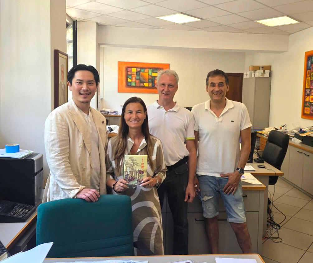
工房の皆様と記念に1枚。
真ん中の女性が、社長の
エリサさんです。
お忙しい中、取材を受けて
下さり、本当にありがとう
ございました。
また、こちらの工房をご紹介
くださいましたシルヴィオ
フィオレッロ社の皆様にも
改めて御礼申し上げます。
A commemorative photo with everyone at the workshop.
Thank you very much for taking the time to welcome us despite your busy schedule.
We would also like to express our sincere gratitude to everyone at Silvio Fiorello for introducing us to this workshop.
こうした物づくりの現場を
見たことで、店頭に並べた
ネクタイをわたくしどもも
一層愛おしく感じます。
「こんなに高価なの?」
との驚きに相応しい
価値があることを、
これからも真摯な心で
発信してまいります。
Seeing this place of craftsmanship has made us feel even more affection for the ties displayed in our boutique.
We will continue to share, with sincerity, why these ties truly carry a value worthy of that first question: “Why are they so expensive?”
今回ご紹介した工房で
プリントされた生地を
使ったネクタイは、下記
オンラインストアにて
お求めいただけます。


コメントを投稿するにはログインしてください。